

Where to Start Picking a Color


Sometimes decision paralysis kicks in. There are so many colors, which one is the right one? Or I don’t know what I like. Here are a few easy ways to break out of that cycle of thinking. But before we get to color inspiration, here’s some great news — you do know what colors you like. Some helpful places to look for color inspiration are:
- In your closet. Take a look at your clothes and accessories. What colors do you see repeating in your wardrobe? What colors do you wear most often? You’ll see repetition, let it guide some of the color choices in your home.
- In books, magazines or online. A classic source for go-to inspiration. If you’re really feeling stuck, look at homes and rooms designed by pros and find a design you like. From there, pull elements from that space into your own. You’re seeing color being used in a way that works and that you know you like. From there it’s sourcing products that fit your budget and style.
- In works of art. Patterns, a painting or any piece of art that you love shows successful color combinations. Use it as a jumping-off point for the rest of the room and pull colors from that piece.
- Make an inspiration board. Take the inspiration offline by gathering fabric swatches, paint samples, pictures and inspiring objects. Put them together on a tray or board and notice colors and textures that repeat. Pull color combinations that you see and like.
Tips for Choosing Paint That Aren’t Neutral Colors
We’re going to share a secret. By the time you’re ready to look at paint swatches, it’s rare to still be looking at every color of the rainbow. Your inspiration helps you pare down to a few colors. Then gather your paint swatches and start comparing. Here are a few techniques to help the colors throughout your home feel cohesive.
Adding Color in an Open Concept Home

In this case, committing to a specific color that isn’t a neutral gets more challenging since there is no separation between rooms. A paint color is a big investment, so it makes sense to use a neutral and then add color through décor items like artwork, furniture and accessories, like rugs and pillows. Here’s how:
Pillows
Use your color inspiration and choose pillows that feel like they fall within your chosen color family. If you find patterns but are nervous about how they’ll work together, mix a large, medium and small print together using a unifying element like color. So maybe you’ve got an oversized floral, a stripe and a micro polka dot pillow, they’ll all hang together if there are hints of the same color in each.


Rugs
Rugs are one of the smartest pieces to help you on your color journey. If you find a colorful pattern you like, you can pull individual colors from that pattern and find other ways to incorporate them in the room. Choose furniture, décor and artwork in shades found in that pattern and the whole room will feel tied together.


Artwork
Find artwork you love and (like pillows) try to identify some unifying elements to help it work together. Maybe all the artwork in your home is done on canvas, maybe it’s all abstract art or maybe the color of the frames is the same. Pull colors from each piece and again, use them in a few places throughout a room to create a feeling of cohesion and connection.
If you do want to add color via paint, instead of using rooms to separate color, use architectural details like arches, moulding, columns or beams to create different zones. Just keep in mind that if you can see a different paint color in the next room or the spaces are connected, you want the colors to complement each other.


Take a Color Cue from a Paint Strip

If you find a color you love and need to paint other rooms or transitional spaces and would like them to feel related, take a cue from your paint strip. See where the color sits on the strip and what lighter or darker colors it’s grouped with. If you use one of these lighter or darker colors, it feels similar to, but not the same as, that initial color. The same thing can be done by asking to mix a paint a certain percentage lighter or darker. You can play with the color gradient for different rooms.
Repeat Colors in Your House

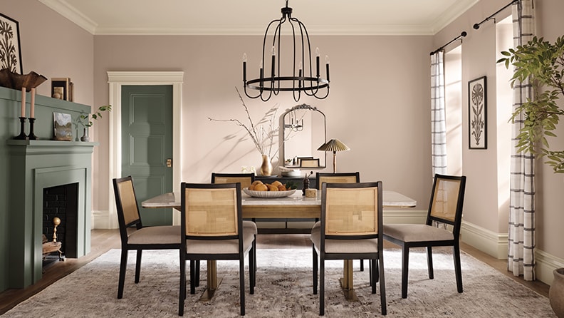
Think of it like a signature. When you’re coming up with color inspiration for your home, you’ll see a few colors repeat themselves. If those are the colors that make you think of home, use them throughout your space. For example, if you love a dusty pink, a deep forest green, and a neutral tan and gray, let them show up in different ways in each room. Your bedroom could have a statement green velvet headboard and touches of green and pink in the rug. The living room couch could be gray, but there are pops of the same green and pink in your living rug or the artwork. Seeing the same colors in different ways throughout a home makes each room feel different but related.
A New Take on an Accent Wall

If you’re looking for the same impact of an accent wall, but struggle with placement in an open-concept room, try a painted detail. A large stripe or arch adds color but doesn’t need a small, separate section of wall. Use an architectural detail, like a doorway, window or moulding, to provide a place for a stripe (or anything that feels continuous) to end.
The Ultimate Color Picking Tip

It never hurts to test a paint before you buy it. Buyer’s remorse happens when you commit to a color without seeing a sample on your wall. It’s important to see the paint in relation to your home décor, at different times of day and with the other paint colors already in your home. So do yourself a huge favor and take the time to look at samples and once you’ve narrowed it down to a few colors, paint a test swatch on the wall. You’ll be happy you did.