
Pick the Perfect Color for Any Space
It’s easy to walk into a room and know whether or not you love the color scheme—as long as it isn’t your own home. The moment you’re faced with choosing a single color from the wild world of paint for your space can feel big. “Overwhelming” and “massive” are two other words that come to mind. But don’t give in to the indecision! Painting a room can give it a very necessary breath of fresh air.
To help you narrow down the (many) options, Southern Living editor Ivy Odom polled design editors for their favorite interior colors. So pull yourself out of the mountain of paint swatches you’ve collected, take a deep breath, and read up. Also try out the room visualizer tool to help you see before you buy.


1. Forest Green - Try Oakmoss


Incorporating a rich shade of green can help bring the outdoors inside. It’s a timeless choice while maintaining its status as a bold punch of color. While you will see it in the homes of your favorite celebrities (and your coolest friends), it doesn’t fall victim to the trend cycle.
2. Organic Neutrals - Try Soft Tan or Villa Grey

While a punch of color can be fun, sometimes you need to anchor art or home decor with a subtle, neutral tone. Make sure whatever you choose has a nature-inspired green or brown undertone—this will give your space a relaxing vibe, and help inject a bit of nature’s color palette into your home.
3. Creamy White - Try Pearly White

Interior designers prefer paint colors with warmer undertones, as they’re more welcoming and less stark than cooler hues. Plus, a creamy white will pair well with just about any accent colors you introduce into the space. If you’re looking for a color that will stand the test of time and hold up to your interior style evolutions, do yourself a favor and go for a soft white.
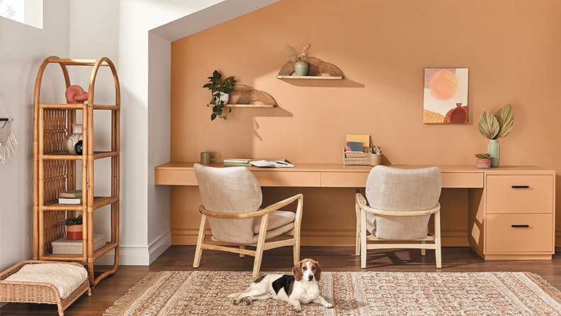
4. Spicy Hues - Try Restrained Gold

5. Dark, Moody Shades - Try Waterloo or Dark Auburn

For full-on cozy vibes, look to dynamic options like cranberry, deep navy, slate gray, and chestnut. While leaning on the neutral side of color pops, they provide a relaxing hug of hue for lounge spaces.