
Interior Home Paint Colors: What You Need to Know


The color wheel has thousands of colors to choose from, so knowing how to pick paint colors can be daunting for even the most confident painters. Here are some general guidelines to follow when looking for perfect interior home paint colors:
- Paint is generally divided into two groups: bolds and neutrals. Neutrals include pastels, beiges, grays and whites. Bold colors are vibrant reds, greens, pinks, blues, greens and purples.
- Neutrals are generally considered to be a safer choice because they blend with many different décor styles. If you want to change your décor later on, you can often keep the same color.
- If you're unsure how to begin picking paint colors for your home, find a piece of furniture or decorative item that you love and work from there. Choose shades of paint that match the item, being sure to include neutrals in your color scheme.
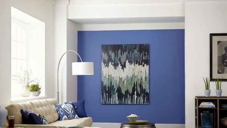
- Love peacock blue or fuchsia but nervous about painting an entire room of it? Try painting one accent wall or a small space, like a hallway or a bathroom.
- Light interior paint colors can make a small space seem larger.
- Picking dark paint can help light-colored objects stand out.
- Repeating a paint color through several rooms creates a sense of harmony.
How to Pick Paint Colors With Samples
Colors in the store often look different at home because of the changes in light. Rather than running the risk of picking a gallon of a paint color that you don’t like, pick a paint color in your home by trying a few sample pots. You can start by using our visualizer and shopping for paint samples by color. Purchase three or four colors that you like and paint a 1-foot-by-1-foot square in each color on your wall. Over several days, watch the paint colors at different times of day, comparing natural sunlight versus artificial lighting. When you pick a paint color, you’ll often find the color that you were convinced was the perfect one in the store isn’t the one you end up selecting.
Consider the direction each room faces when choosing samples. North-facing rooms usually have steady light, so paint colors will be stable throughout the day, while south-facing rooms' light is more variable, causing some colors to appear washed out at certain times of day. East-facing rooms are sunnier in the morning, and west-facing rooms are brighter in the afternoon, so pay extra attention to how colors appear at certain times of day.
How to Pick Paint Colors for Your Ceilings
The ceiling is often overlooked, and the idea of painting it can be intimidating. A general rule of thumb: Paint the ceiling three shades lighter than the walls, which will make the walls feel higher. Another easy way to lighten the ceiling is to get a half-strength version of the wall paint. If you’re trying to create a cozy environment, paint the ceiling a darker color; just be sure that the room is large enough for this effect.
As with wall colors, the light each room receives will affect the appearance of the ceiling color and texture. Use a sample on the ceiling to get a sense of how sunlight will impact the paint color.
How to Match a Paint Color

Trying different paint samples is one way to match a paint color, but you can also use Lowe’s in-store paint color matching service to match a paint color to other components of your décor. Just bring a sample of fabric, flooring or carpet to your local Lowe’s and we can identify the color or create a matching color for you.
If you’re matching an existing interior color, knowing how to match a paint color is just part of the process. Remember to match the paint sheen as well. Take a look at The Paint Finish Cheat Sheet below for tips.
Find the Saturation Point
If you’re picking more than one paint color for a room, try to stay in the same hue, which will make the palette seem more unified. An easy way to do this is to look at a paint chip with three or four shades of the same color and work from this palette.
Add a Pop of Color

If you're painting the walls a light neutral color or a pastel, pick a paint color in ultra white for your trim work and moulding to make the wall color stand out. Chalk paint (also known as chalky paint) creates a distressed or vintage look and can also emphasize wood details.
Another option is to pick a paint color for the trim and moulding that’s a shade lighter or darker than the wall to create visual interest and variety. Check out our guide on how to paint a room for more tips.
Create an Emotional Response With Interior Home Paint Colors

Studies have shown that room color can affect moods and emotions. Some colors can create an overall sense of calm, while others are high energy. Find out the colors that work best in each area of your home.
- Restaurants often use red because it’s known to increase appetite and conversation. It’s a high-energy color, so it works best in areas where you socialize, such as living or dining rooms. Avoid this color in the bedroom.
- Orange evokes power and is highly energizing. It’s also known to increase appetite, so consider it for a kitchen or dining room. A little goes a long way, so use it in moderation.
- Soft yellows are associated with happiness and warmth, but bright shades can increase frustration and anger. It's good for the kitchen because yellow is also an energizing color.
- Green is a calming, refreshing color and reminds us of nature. Use this color in rooms where you want to relax. It’s one of the best colors for bedroom walls.
- If you’re trying to create a serene, spa-like environment, consider blue. Like green, it’s a calming color and is another one of the best colors for bedroom walls. Brighter blues increase productivity, which is good for an office.
- Purple has historically been associated with royalty and wealth. Use it in living or dining rooms to pack a luxurious punch. It’s also thought to stimulate creativity.
- Brown is a cozy color and great for areas where people gather, such as the living room or den.
- White helps to brighten up a space and creates a sense of cleanliness.
If you’re wondering how to pick the best color for bedroom walls, these tips and our article, Bedroom Paint Color Ideas, give you the inspiration you need to get started.
The Paint Finish Cheat Sheet
So you’re standing at the paint counter with the perfect color in hand, and the store associate asks what finish you want. You stare blankly, having no idea what’s best. Here’s a cheat sheet to help you confidently make your selection.
Vary the finishes you use choose to create an interesting spectrum of paint appearance.
Flat
This finish is typically used on ceilings and in bedrooms and living rooms. It’s also good for walls that have a lot of imperfections. Flat finishes are easy to touch up but hard to clean, so avoid using them in kitchens and bathrooms.
Flat finish paint colors may absorb light, so it's a good idea to try a slightly lighter paint sample than the color that first appeals to you in the store.
Eggshell
This finish has a low sheen and is ideal in bedrooms or living rooms. Eggshell marks easily, so avoid high-traffic areas like hallways or mudrooms. It’s easy to touch up. While flat finish is the best for covering imperfections on walls, eggshell can also be used for less severe coverage of uneven surfaces.
Satin
This is a silky finish that you can scrub, so it’s good for areas like kitchens, hallways, bathrooms, children’s rooms and family rooms. Touchups are more difficult with satin because of the sheen. Satin should be reserved for walls without imperfections, as its glow can emphasize irregularities on the wall.
Satin finish paint is a good option to emphasize details, such as trim.
Semi-Gloss
This finish is resistant to humidity, so it’s good for kitchens and bathrooms. It’s also perfect for moulding and woodwork. Semi-gloss is easy to clean but difficult to touch up.
Gloss
Gloss shows every imperfection, so it’s better for woodwork and moulding than walls. Like semi-gloss, gloss is easy to clean but difficult to touch up.
To make a bold paint color pop, use many layers of gloss-finish paint. The extra sheen will reflect light and create a bright, modern look.